Blog Feed

Symbiosis in the NBA

It’s been a while since I’ve done an NBA analytics project, but I’ve recently been intrigued by player-player interactions within teams. Oftentimes, fans have a hunch that two players “mesh” well together or two players’ playstyles do not complement one another. However, for the most part, this is a qualitative observation. In this article, I will present a simple, quantitative way of discovering favorable/unfavorable duos in the NBA (in addition to investigating specific duos).

Simple concepts

The concepts discussed in this article come from biology. Specifically, in ecology, the term symbiosis refers to the relationship between two different species. These relationships can take many forms – mutualism (both species benefit), parasitism (one species benefits, the other species is harmed), commensenalism (one species benefits, the other species is neither harmed nor benefitted), neutralism (neither species is affected), and competition (both species are negatively affected).

Graphic from http://www.proprofs.com

When talking about basketball, we are no longer talking about biological species but rather interactions between two players in a lineup. For instance, a mutualistic relationship would be a relationship which having two players in a lineup is more efficient than than having one or the other. If we are appropriately able to single out such mutualistic relationships (and discover which players do not mesh well together i.e with a competitive relationship), this is a useful tool for coaches when building lineups.

Quantifying Symbiosis

In order to quantify the relationships between players, I follow a very simple process. Let us assume that we are attempting to quantify the symbiotic relationship between player A and player B on a given team X. We will sort lineups for team X into 4 categories:

  1. lineups with player A but not player B,
  2. lineups with player B but not player A,
  3. lineups with both player A and player B, and
  4. lineups with neither player A or player B.

We can then calculate net rating for categories 1, 2, and 3. If the net rating of category 3 is greater than the net rating of categories 1 and 2, then this is a mutualistic relationship (a favorable duo to play together). Through this simple process, we can determine the relationship between any two given players on a team. Although this process is not perfect, it potentially could give us an indication of how duos play together. A potential problem with this approach is that if the replacement player in a lineup for a given player B is significantly worse than player B, this would exaggerate the benefit of adding player B to a lineup with player A.

Distribution of Duos

We begin our analysis by calculating values for every given duo in the NBA (such that they have played at least 400 minutes together and 400 minutes apart). This leaves us with 672 duos in the league.

In the above graph, we first note that the upper right corner is mutualistic duos, while the bottom left is competitive duos (duos that do not play well together). The other two quadrants represent duos where one player is positively affected while the other player is negatively affected.

The first thing that I found interesting was the correlation between the two variables in the plot (Spearman correlation was 0.44). Our correlation shows us that there is a moderate linear relationship between our two variables (meaning that if player A impacts lineups with player B negatively, we have a general idea that player B may negatively affect lineups with player A).

Interactions within Teams

Phoenix Suns

In this graph, each box represents the net rating change when adding Player B to a Lineup with player A (a white box represents a duo which we do not have enough minutes of). To understand what this means, we will ask a question: How do lineups with Chris Paul and DeAndre Ayton compare to lineups with just Chris Paul (and not DeAndre Ayton)?

With the phrasing of this question, player A is Chris Paul and player B is DeAndre Ayton. The value is then -7.2. What does this mean? A Suns lineup with Chris Paul and not DeAndre Ayton is more favorable than a lineup with both Chris Paul and DeAndre Ayton by approximately 7.2 points per 100 possessions. Similarly, if we look at lineups with just DeAndre Ayton and not Chris Paul (player A is DeAndre Ayton now), the value is -7.4: again unfavorable.

Surprisingly, the symbiotic relationship between Chris Paul and DeAndre Ayton seems to be competitive. This result seemed somewhat counterintuitive to me.

Thus, I decided to delve a bit deeper. Based on data from pbpstats.com (great resource), lineups with both Chris Paul and DeAndre Ayton have a net rating of 6.93 on average. However, when on lineups separately, Paul and Ayton’s lineups have net ratings of 13.27 and 12.46, respectively.

This could very well be an artifact, but it still remains an interesting result to investigate further.

On more intuitive results from our graph, for the most part Chris Paul has a positive effect when added to lineups. Further, Devin Booker/DeAndre Ayton seem to have a somewhat mutualistic relationship, as do Devin Booker/Chris Paul.

Los Angeles Lakers

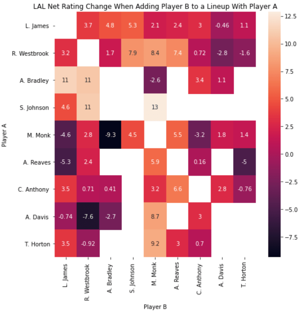
In our graph, we see that Malik Monk and Austin Reaves have a very strong mutualistic relationship with one another. This is a relationship that’s caught the eye of the Lakers coaching staff/front office and was a duo that was used in a big win against the Warriors.

Outside of this duo, interesting duos I found were Malik Monk and Avery Bradley (competitive), Anthony Davis and Russell Westbrook (competitive), Avery Bradley and LeBron James (mutualistic).

Golden State Warriors

For Golden State, some interesting combinations were Steph/Draymond (mutualistic), Steph/Poole (mutualistic). Further, it is clear that the Splash Brother duo hasn’t performed as well as they normally would (although adding Steph to Klay lineups is positive, adding Klay to Steph lineups isn’t improving net rating of those lineups).

Minnesota Timberwolves

The last team we’ll look at is one of the hottest teams in the league right now. Some interesting relationships: KAT/D’Angelo (mutualistic), Anthony Edwards/D’Angelo (mutualistic), Pat Bev/D’Angelo (mutualistic).

Conclusion

I think this is a good preliminary step into better understanding how lineups work together. Although this is a far-from-perfect way of measuing the effectiveness of specific duos in the league, I do think this provides some insight on specific players that mesh well with other specific players, as well as specific players who do not play well with specific players.

Finding Determinants of NBA Shot Probability using Interpretable Machine Learning Methods

This is a project that I am presenting as a poster at the CMU Sports Analytics Conference. A full version of this research (and associated code) is here: https://github.com/avyayv/CMSACRepo.

You may also view the poster I created at: http://www.stat.cmu.edu/cmsac/poster2020/posters/Varadarajan-NBAShotProb.pdf

Overview

Since the advent of basketball analytics, a metric that is accurately able to determine the relative worth of player’s defense has been widely sought after. It is widely regarded that features like shot defense are key to a player’s defensive identity, but regularized on-off metrics like RAPM are unable to take this into account. Using player-tracking data, we are able to extract information about shot defense.

We determine the relative importance of a of a set of offensive and defensive factors on individual shots near the 3 point line. Using 2015-16 SportVU data, where player and ball positional coordinates are captured 25 times a second, and the accompanying play-by-play data, we extract the following features: ‘Distance Between Shooter And Defender’, ‘Shot Distance’, ‘Difference Between Shooter And Defender Height’, and ‘3PT%’. 3PT% is calculated for the entirety of the 2015-16 season.

We then train a gradient boosting model to predict the shot success probability of a given shot. Although this can be useful on its own, it does not directly provide the relative importance of each of the input features.

To this end, we use interpretable machine learning techniques, specifically shapley values. Using TreeSHAP, we determine the importance scores for each input feature, per shot. Aggregating these values over all games in our dataset, we estimate the relative importance of each feature.

Model

Our preliminary goal is to devise a method to statistically determine the probability of a shot being made. We use XGBoost to model shot probability. Based on a hyperparameter search, we use the following hyperparameters: learning rate=0.05, max depth=3, n estimators=100, basescore=0.45, colsample bytree=1, subsample=0.8, gamma=0. Our chosen booster is ‘gbtree’.

Model Metrics

Although our model’s predictive power isn’t extremely strong (AU-ROC=0.56, AU-PRC=0.43), we still perform better than if we only used 3PT% to make predictions. The league average 3PT% was 0.35, so a random estimator would have an AU-PRC of 0.35. We specifically want to deduce what the model is learning within this improvement above 0.35.

Interpretation

We are then able to interpret the model’s predictions. Specifically, we wish to concretely determine which features the model finds to be the most useful to predict the shot probability.

To this end, we use shapley values (an idea from cooperative game theory): a concrete way of “splitting up” contributions among features. Shapley values assign specific negative and positive values, which signify whether a specific trait positively or negatively the model’s predictions. The higher the shapley value for a given feature, the more the model’s prediction was affected by that feature.

In order to solve for our shapley values, we use TreeSHAP. For each given datapoint (a single shot), we able to extract the shapley values for the aforementioned features fed into the model ‘Distance Between Shooter And Defender’, ‘Shot Distance’, ‘Difference Between Shooter And Defender Height’, and ‘3PT\%’.

Shapley Values Summary

In the above plot, we see the average shapley value for all of the data points. Specifically, the distance between a shooter and their defender is more important than the 3PT%, Shot Distance, and the Difference between the shooter and defender height. In addition, the difference between a shooter’s height and a defender’s height has little to no significance when determining the probability of a made 3PT shot. Finally, the shot distance on a 3PT shot seems to be less significant than the Distance Between Shooter and Defender and the shooter’s 3PT%.

In the more detailed version of our shapley value plot, we are able to pinpoint the trends for each of the features. For instance, in the 3PT% plot, we notice that the higher the 3PT%, the higher the shapley value. Although this specific information is fairly intuitive, it serves as a sanity check for how our model actually was able to learn. Similarly we can determine the distribution of shapley values. For instance, there is not much variance in the shapley values for ’Difference Between Shooter and Defender Height’, while there is significant variance in the ’Distance Between Shooter and Defender’.

Discussion/Conclusion

We believe that our ideology can help coaches adjust their strategies, optimizing for specific shooter situations. In our specific research, we hope to calculate shapley values for specific players.  For instance, if we can determine the associated shapley values for a given player on defense, the summation of all of these values across the season can bring us closer to a unified defensive statistic. This can not only be aggregated over a season, but over specific games as well, allowing us to answer questions like: “How well did Anthony Davis play on defense during game 6 of the finals?” This can also help isolate offensive achievement as well.  But beyond this research, we hope that our methods can show that shapley values area field worth exploring in sports. Whether discussing the relative importance of specific attributes on a shot, or discussing lineups as a whole, we believe that the calculation of shapley values can help us understand the relative importance of features. Our ideology is similar to that of Matt Ploenzke’s Submission to the Big Data Bowl. Specifically, we hope that our method can show the benefits to intepretable machine learning methods in general. Generally, machine-learning methods are considered to be black-box learning methods, but we believe that concepts like shapley values can help decipher these methods. This can help us understand the way that these models are learning, allowing us to better understand sports as a whole. Some improvements on this research include improving model performance and comparing our shot probability model to existing shot probability models.

Where do assists come from? (Part 2)

A few weeks ago, I did some analysis with archived SportVU Player Tracking data (2015-16), looking at where on the court assists come from. You can read about that analysis at these links:

Blog post: https://analyzeball.com/2020/06/02/where-do-assists-come-from/,

Specific players: https://twitter.com/avyvar/status/1267189790388056064

League wide trends: https://twitter.com/avyvar/status/1270892658437705733).

Here, I’m a deeper dive on this data, looking at assists off misses and comparisons by position (Guards, Forwards, Center).

In addition, you might realize that the overall distribution of assists differs slightly from my previous tweets. This is because I used a more robust method of discovering assists from the raw SportVU logs. To find a general timeframe for when assists occurred, I have been using play-by-play data. But now, I determine the exact time of shot release time using calculus (smoothing, and then taking the derivative of the ball height with respect to the ground) and then backtracking to determine the last pass to this shot. This led to a significant increase in the number of assists in my dataset (around 2x more assists from before), leading to a change in the overall distribution.

Passes by shooter location

Here, we see a grid of shooter location and whether the shot was made or missed.

You can see that the distribution of assists for misses is quite similar to that of makes.

As we often see when we watch film, the corner-3, kick-out assist is widely popular in the league. Here’s an example.

This is an example of what makes the kick-out assist on the corner-3 so effective. Cody Martin drives in, attracting 3 defenders leaving PJ Washington wide open in the corner.

Splitting up by position

In general, from these graphs, it seems like Guards make assists farther from the hoop that Forwards and Centers, which is somewhat expected (based on offensive positioning bias).

However, I found it interesting that Guards pass more often from behind the 3 point line that Forwards.

This Jamal Murray assist clip is a good example of an action that guards perform more often than forwards (on above the break 3’s)

Here we see Jamal Murray getting double-teamed, Jokic setting a screen, eventually leading to Jamal Murray making a pass from behind the 3 point line. Will Barton fakes out Willie Cauley-Stein, eventually leading to an open look from 3.

Similarly, this clip highlights Forwards’ tendencies well.

And here we see a slightly different above the break 3 assist. PJ Washington makes a pass that resembles a kick-out corner-3 assist to Jalen McDaniels. Jalen McDaniels makes a cut toward the top of the key attracting two Miami defenders, leading to an open above-the-break 3 for Caleb Martin.

New Player Graphs

As I stated above, my new way of determining assists from the raw SportVU data is more robust. As a result, there is more data and gets us closer to the actual distribution from the season. The reason why I still am not confident in stating that these are the true distributions is because (a) Not all games from 2015-16 were in my dataset of raw logs and (b) I still am unable to extract all assists from the logs that I have. The players which I have placed below all have 80+ assists mapped for both made and missed shots. The original heat maps which I plotted were about 50-60+ assists per map. I will also be releasing my post-processed CSV file with all of the mapped assists at the end of this post.

But you can see that we need a lot of data to actually make real conclusions. The individual player graphs could be a little bit more helpful if I had more data, but for right now I’d mainly trust the league-wide and position specific graphs.

As we saw from my graphs from my original tweet, the overall distributions of some players seem to have changed a bit from before. These are definitely getting closer to the true distribution of where assists come from.

(Updated). Below each of the graphs, I have also added the distributions of assist from my tweet https://twitter.com/avyvar/status/1267189790388056064 for comparison purposes.

Ricky Rubio

Current Distribution (more data, more accurate)

Made (left) Missed (right)

Old Distribution (less data)

Image
Made only

Stephen Curry

New Distribution (more data, more accurate)

Made (left) Missed (right)

Old Distribution (less data)

Image
Made only

Chris Paul

New Distribution (more data, more accurate)

Made (left) Missed (right)

Old Distribution (less data)

Image
Made only

LeBron James

New Distribution (more data, more accurate)

Made (left) Missed (right)

Old Distribution (less data)

Conclusion

For one, the distribution of assists on made shots vs. assists on missed shots are quite similar (league-wide). When we look at individual players, there seem to be differing distributions. But again, I would refrain from making any judgement about individual players based on this data.

In addition, there does seem to be variation between assist heat maps for different NBA positions.

One topic that interests me is defensive positioning on made/missed and assisted/not assisted shots by shot location (will be writing another post about this one soon, there are some interesting results).

If anyone has any suggestions my twitter is @avyvar and my email is avyayv@gmail.com.

Here is a repo containing the assists (in CSV format) https://github.com/avyayv/mappedassists. Let me know if you’d like me to clarify anything.

Acknowledgments

Thanks to Dean Oliver (@DeanO_Lytics), Todd Whitehead (@CrumpledJumper), and Patrick McFarlane (@py_ball_) for their feedback on this project. A lot of this post was based on their suggestions.

I found the videos for each of the plays using 3ball.io.

Playing With Win Probability Models

I recently developed a win probability model for the awesome py_ball package in Python. The package itself makes NBA/WNBA data accessible to a wide audience. If you haven’t seen it, you should definitely check it out. The link is https://github.com/basketballrelativity/py_ball.

In this blog post, I’ll describe the methods I used to develop the model.

Methods

Our model heavily relies on a series of logistics regressions, which are dependent on (a) the amount of time remaining in the game (b) the point differential and (c) who has possession. As of right now the only bias we introduce at the beginning of the game is home court advantage, which is why the home team always has slightly better odds than the away team. This is because we feed everything into the model with respect to the home team, so the model learns that the home team has a slight advantage. We are hoping to add betting odds to find true pre-game win probabilities.

In order to develop the model, we use a method that Brian Burke used in his win probability models, splitting up the game into multiple groups.

We split the game up into 960 groups (one group every 3 seconds), where we run a separate logistic regression each. Each logistic regression takes in the point differential and who has possession. We do not need to explicitly input the time, because each model is only trained on a specific timeframe.

Logistic Regression in Machine Learning using Python | Towards ...
Graphical representation of logistic regression

For games that go into overtime, we treat the 5 minutes left as if there are 5 minutes left in the fourth quarter. This is to ensure that there is enough training samples for the model to actually learn something. For instance, there are very few games that go into 4OT, so a logistic regression model would not actually be able to recognize any trends with a lack of data.

The model is trained on 5 seasons worth of data from 2013-14 to 2017-18 games.

Results

We evaluated our model on the 2018-19 data, using a brier score.

Brier Score definition from wikipedia

The brier score is the average of the mean squared error for every time frame. For instance if the model predicts a 0.58 probability of winning at a given time and that team won at the end of the game, we add (1-0.58)^2 to the brier score. We add all of these values for the entire game and divide by the total number of events. There is one event every 3 seconds.

We received a brier score of 0.167 for our model. This is a fairly decent value, because this means, on average, we are predicting the outcome of the game correctly.

Comparison

The following examples are comparisons between our model (top) and inpredictable.com’s model

Kobe Bryant’s last game (LAL vs. UTA 2015-16)

ATL vs. NYK (2016-17)

DEN vs. DAL (2019-20)

Usage

The model will be available at https://github.com/basketballrelativity/py_ball. Example notebook using the win probability model is here https://github.com/avyayv/winprobability/blob/master/pyballpackage.ipynb.

Where do assists come from? (Part 1)

I recently tweeted some assist heat maps that were generated using 2015-16 SportVU data here.

Although the individual player heat maps are interesting, I wanted to look at more league-wide trends. I also wanted to explain my methods a little bit more.

Why?

The reason why I found this specific problem interesting was because of its potential implications.

Players in the NBA and all of basketball have inherent bias for where they prefer shots. For instance, if a player like Ben Simmons were standing at the 3-point line, you wouldn’t guard him as tightly as you would Stephen Curry. Essentially, you could adjust coaching strategy if you better understand player tendencies.

Analysis of the specific locations of which players prefer to pass and shoot could prove useful, as it would help players anticipate what could happen next in a specific play. This would eventually improve defensive strategy for teams.

Methods

As I stated above, I used the 2015-16 SportVU data for the generation of these graphs. This data captures every single player on the court and the ball ~25 times every second. Although it would have been optimal to have multiple seasons’ worth of data, I was unable to find it.

I cross-reference this SportVU data with play-by-play data from stats.nba.com to determine when assists occur.

Then, using an approximate timing of the assist event from the play-by-play data, I record the location of both the passer and the shooter. This entire process is done with pandas and Python.

After this, I use a KDE or kernel density estimator from Seaborn to generate the heat map plot. The KDE allows us to use our sparse data into more of a continuous spectrum for better visualization.

The visualization is heavily based on the post at http://savvastjortjoglou.com/nba-shot-sharts.html on visualizing NBA shot charts.

Overall League

Left: Assist Locations, Right: Point Locations

As stated in the caption, the left image is a heat map of all the assist locations in my limited dataset. The right image is a visualization of just the shots off of those assists.

Right off the bat, there seems to be more variation in the locations in which players take shots than where they pass from. This makes sense, as point guards are typically the ones assisting the ball, most of whom stay around the top of the key.

Clearly, based on the dataset, “drive-and-kick” assists aren’t as common as the normal, top of the key assist.

Further, as expected, we see that players standing in the corner are more likely to shoot than make a pass.

How good is the generalization?

undefinedundefinedundefined
Left to Right: Eric Bledsoe(PHX), Stephen Curry(GSW), John Wall(WAS)

The above charts show that the generalization above does not capture the variability per player.

Even for players who play the same position (PG): Eric Bledosoe, Stephen Curry, and John Wall, there are stark differences between their individual assist charts.

It was interesting to me that Steph has a tendency to assist from the right side of the court, while John Wall has a tendency to do so from the left side. However, with the limited size of the dataset I was working with, it’s possible that the data I was given does not capture the full picture.

What can we do with this information? Well, we clearly see that Eric Bledsoe is more likely to pass when he’s in the paint versus when he’s at the three-point line. If a coach is able to adjust his strategy of how to defend a player like Bledsoe, it would likely improve that team’s overall defensive numbers.

LeBron James (CLE)

To me, LeBron specifically was especially interesting. It seems as though, of all of the stars with significant assist numbers, LeBron has the most unpredictable assist locations.

This is one of the aspects of LeBron’s game that makes him such a difficult player to defend. Not only can he shoot and pass, but he can do both of these actions pretty much anywhere on the court.

undefinedundefinedundefined
Left to Right: GSW, CLE, MEM

Not only that, but teams also have stark differences overall. Above are 3 different teams, the Warriors, Cavaliers, and Grizzlies. All of these teams have vastly different ways of play, and as a result have different locations in which they pass.

Future Work

In the future, I want to be able to apply these similar types of visualizations to other seasons’ tracking data. As stated here, it would be interesting to see how players/teams change over time.

I also think it might be interesting to run a sort of clustering algorithm on this data combined with shot chart data, to identify types of players.

If you have any suggestions on what else I could do with this information, please let me know through email (avyayv@gmail.com) or Twitter (@avyvar)

Elam Ending Analytics

With the NBA season being postponed, there has been a lack of basketball in the world. As a result, I thought it would be interesting to look into depth about how the Elam Ending has a place in the current NBA and how it would work.

What is the Elam Ending?

If you didn’t watch the All-Star Game in 2020, the Elam Ending is an idea where each team at the start of a period has a target score rather than fighting against the clock. Rather than having a 5 minute overtime or a 12 minute fourth quarter, each team would have to score a certain number of points, based on the higher score in the game.

For instance, if Team X had 75 points and Team Y had 70 points at the end of the third quarter, the target score would be some number of points above team X’s score. In the All-Star Game, this number of points was 24, in memoriam of Kobe Bryant. If 24 was used in this hypothetical game, the target score would be 99, and the first team to reach 99 would win the game.

A more in-depth description of the Elam Ending can be found here.

Overtime

Applying the Elam Ending to overtime in the NBA has been widely suggested by NBA fans. In fact, Daryl Morey, the Houston Rockets’s GM, supports the implementation of the Elam Ending as well. It seems like a perfect, non-intrusive way of applying the idea to the NBA. As a result, we will investigate how the Elam Ending in overtime would work in today’s NBA.

How many points till the target score?

Teams have scored, on average, 10.3 points per overtime period in the league from 2011-12 to 2019-20.

The above graph describes the year by year points in overtime for teams. It is evident that the number of points being scored in overtime is increasing each year, due to the rise of three point shooting and efficient basketball. As a result, if we would like to maintain roughly the same amount of game time, we should have the target score be 11 points from the score in regulation.

How would win probabilities change?

@inpredict on Twitter

For the purposes of this article, I will be using the following probability values to examine how the Elam Ending would change things. Thanks to Mike Beuoy (@inpredict on Twitter) for providing these values so I didn’t need to find them myself. In addition, for my comparisons to the timed overtime period, I use http://stats.inpredictable.com/nba/wpCalc.php.

This graph gives the frequencies of points scored on a given possession. During the 2019-20 season, teams scored zero points on a possession 50.5% of the time, 1 point on a possession 3.1% of the time, etc.

I wanted to examine this in depth, so I started from the beginning of a play with the jump ball. I tried to answer the question: how much does the jump ball affect the outcome of the game?

Using the probability distribution described above, I ran 1 million simulations of an overtime period, going up to 11 points.

The team that won the jump won the game ~54.4% of the time, while the team that lost the jump won the game ~45.6% of the time. This implies a ~4.4% advantage for winning when game when your team wins the jump ball.

Comparatively, the probability of winning the game given a 5-minute overtime period is ~0.542, negligibly lower than the Elam Ending probability. As a result, it does not seem that the importance of the jump ball changes with the implementation of the Elam Ending.

The next step is to see how the probability of winning a game in the Elam Ending compares to the probability of winning a game in regular overtime.

The first thing to realize is that the win probability in normal overtime is a function of the score differential and the amount of time left in the game. In comparison, the win probability in the Elam Ending is a function of each team’s score and the number of points to the target score.

A major difference that we realize is that as the time approaches 0 in a normal overtime period, the probability of winning a game approaches 1 or 0 with few exceptions. In contrast, with the Elam Ending, the probability of winning the game does not approach 1 or 0, as the team score is not a continuous variable like time is.

This nature is, in part, what makes the Elam Ending so exciting. It makes the losing team always feel like they have a chance, which leads to good play throughout the overtime period.

For instance, if there are twenty seconds left in a game and it is a four point game in a regular overtime period, the game turns into a free-throw shooting game, which very likely leads to the leading team winning the game. This is also not an exciting game to watch.

Rather, if the score is 6-10 in an overtime period with the Elam Ending, there exists a higher probability that the losing team wins the game. This makes the game far more fun to watch and it prevents intentional fouls.

Below are two graphs highlighting the win probability of a team leading by 4. The x-axis on the normal OT graph is the amount of time left in the game, while the x-axis on the Elam Ending OT graph is the game score.

It is evident on this graph that the win probability for the winning team with the Elam Ending is not continuously increasing.

This can be explained through the following example.

When it is 6-10 vs 5-9 in the period, the losing team is closer to the target score than before. For the winning team, if they take a field goal, they still have the same probability of making it as before. As a result, the winning team does not gain any advantage, while the losing team gains an advantage.

In addition, it is evident that the win probability never approaches 1 in the Elam Ending. This means the game is harder to predict, again, making it more fun to watch.

What types of shots should you take?

I also wanted to look at what types of shots the winning teams were taking when they won the game. Obviously the winning team will score more points than the losing team, but what areas of the game was the winning team exploiting.

Below is a comparative bar chart which highlights how many 1 points possessions each team was having, how many 2 point possession each team was having, etc.

Not surprisingly, the winning team was scoring more 3’s and 2’s than the other team. Based on the difference in the heights of the winning and losing bars in each of those categories, teams, on average, outscore their opponents ~3 points more on 2’s and ~3 points more on 3’s. As a result, based on the average shooting tendencies of an NBA team, 3’s and 2’s are equally important in the Elam Ending.

However, it has been proven time and time again that shooting 3’s usually generates more points per shot. As a result, it is obvious that making a high amount of 3’s could prove useful in any game. However, there is also a point where taking more threes is detrimental in the Elam Ending.

In this graph above, I assume that the 3 point shooting percentage is 35% and the 2 point shooting percentage is 50%. Based on these numbers, it seems that you should shoot 90% of your shots from 3-point range in order to maximize your win probability. Of course, that number does not mean very much, as in-game dynamics such as defense could drastically affect this value.

Conclusion

Although the Elam Ending is nontraditional when it comes to professional basketball, the implementation of the rule in the NBA would make games more exciting. It would introduce more randomness to the game, and have fans holding their breaths until the final shot.

Clustering NBA Shot Charts (Part 2)

My previous blog post showed how cluster-able NBA shot charts were. I recently made a few improvements to the model and looked into things that I didn’t look into in the previous article.

A quick summary of that article is that I generated a 14 dimensional vector with shot frequencies for different locations on the court. Then I ran k-means clustering on this vector for each player over a season.

Most of the methodology is the same between the two, so please read the other article for more depth.

Number of Clusters

In my previous iteration, I used 3 clusters. However, I generated a plot that aimed to find the optimal number of clusters. Using the ‘elbow-method’ for k-means clustering, I found that the optimal number of clusters was probably a bit more, around 5.

Clustering Results

After running the clustering algorithm, these were 5 example shot charts for each cluster.

Since we added more clusters, I interpreted what each of these clusters meant.

Cluster 0 seems to represent players who mainly shoot in the paint, but can shoot outside the paint. They don’t shoot many threes. My assumption is that these players used to be traditional big man but are in the transition of becoming stretch forwards.

Cluster 1 seems to represent players who shoot threes and shots in the paint (Moreyball ideals). However, they seem to shoot more threes than paint shots.

Cluster 2 seems to represent players who prefer to shoot midrange shots.

Cluster 3 seems to represent players who play in the paint and leave the paint extremely rarely.

Cluster 4 seems to represent players who shoot threes and shots in the paint (Moreyball ideals). However, they seem to shoot more paint shots than threes.

These are some of the notable players from each of the clusters. Interestingly, LeBron James and Joel Embiid are in the same cluster. Obviously they are not the same type of player, but their shooting tendencies are quite similar. This is why adding something like assist data could be beneficial to the performance of this model.

I was curious so I looked at the Rockets’ distribution of clusters for 2018-19 and this is what I got.

In comparison, this is what the Knicks were.

This highlights that the Rockets really rely on Moreyball a lot (fitting :D), and mainly focus on the three-point aspect of their strategy. Further, the Knicks distribution shows that the Knicks aren’t that progressive in their methods (we knew that).

I then cross referenced the cluster with some statistics to see which clusters relied on the ball a bit more.

These two charts show how the midrange cluster tends to have more opportunity than other clusters. Personally, I believe this has to do with the close correlation between people who shoot from midrange and their reliance on isolation basketball. Players like Kevin Durant, Jimmy Butler, and Carmelo Anthony all fall into this cluster and they are known for playing isolation basketball.

I also cross referenced the clusters with some player statistics, like three point percentage and field goal percentage.

These two graphs help us see that cluster 1 shoots a lot of threes, as they have a higher three point percentage than all the other clusters, but a lower field goal percentage. Further, we can confirm that cluster 3 is the “traditional big man” and is full of extremely poor three point shooters.

Interestingly cluster 2 and cluster 4 have similar percentages for both three point percentages and field goal percentages. However, cluster 2 shoots less threes and more mid-range jumpers, which in general, is less efficient. This is highlighted with EFG% below.

undefined

Cluster 0 is also quite poor at shooting, but they still venture out of the paint more often than cluster 3. When we watch Giannis and Anthony Davis play, we can easily identify this, as we know they are trying to expand their game to the three point shot. However, they are not that efficient from the three point line at the moment.

These graphs also further confirm that midrange players are the least efficient shooters in terms of EFG% and that traditional big men (or merely players who don’t deviate much from the pain) are the most efficient in this sense.

Cluster Distribution Over Time

In the previous blog post, I generated different clusters for each of these years. However, I thought it would be interesting to use the same clusters and see how the distribution of the clusters changed over time.

We see that cluster 2 used to be the most popular for many years. However, with the rise of Moreyball and efficiency, we see that cluster 1 and 4 have become more popular in recent years.

The distribution of the clusters, interestingly, did not change much from 1999-00 to 2008-09. Over this entire timeframe, the number of midrange players decreased slightly, but it is not noticeable. Only recently do we see this complete change in the distribution of clusters.

Future Work

I want to see if I can correlate these clusters to win percentage in some way. This way, we can see what clusters directly translate to winning. I also want to add other mapped data (such as where assists were made from, where rebounds were taken) and see if this helps better cluster players.

You can view all of the players in each of the clusters here https://docs.google.com/spreadsheets/d/1OphZnMi5a0vYPI_QZ1q8mRANT68oocZVQeKJIAK6nv4/edit?usp=shar

Clustering NBA Shot Charts (Part 1)

Methodology

In the NBA, we often assign labels to players, not really looking in depth on what constitutes these labels. Something that we can do to figure out the “definition” of these labels and see whether these labels actually exist is to use an algorithm known as k-means-clustering to cluster shot charts (to find similar shot charts given a set of features).

My approach for clustering the shot charts was to bin groups of shots, much like we do sometimes with visualization. By binning the groups of shots, it means I used data in the form of a vector, highlighting the frequency for individual locations, like so.

Binned FGM/FGA Shot Chart for James Harden

I separated shots into 14 locations as given by the stats.nba.com API, and I created a 14×1 vector per player over each season, containing the shot frequency for each location on the court. The locations are highlighted in the shot chart above. The reason I do not include the field goal percentage is because I was trying to highlight tendencies of the player, and FGP is irrelevant to that in my opinion.

I can’t use the actual raw X-Y coordinates because players take a different number of shots per game, which would make the dimensions of the vector different for every player. This would prevent the usage of k-means clustering on the data.

I ran the clustering algorithm, with the steps highlighted above, for two separate time frames, to see how the clusters have changed over time. The two time frames I selected were the “2016-17”, “2017-18”, “2018-19” (recent) seasons and the “1999-00”, “2000-01”, “2001-02” (old) seasons.

Results

The number I decided on for the number of clusters was 3, but that was an arbitrary number. I can definitely try with a larger number of clusters and see where that takes me.

I first ran UMAP dimensionality reduction and highlighted different clusters, just to verify that there was something to highlight.

UMAP for recent years
UMAP for old years

It’s obviously not easy to make any conclusions from this UMAP visualization alone, so I took some samples from all of the clusters highlighted by the algorithm.

Above, each row represents one cluster highlighted by the algorithm. The first row is obviously a cluster that highlights players that do not deviate from the paint much. It includes players like Dwight Howard and Ben Simmons.

However, the other two clusters that the algorithm highlighted seem extremely similar (2 and 3). Personally, I don’t see any stark differences between the two clusters, but in general, it seems like the second cluster is more inclined to “Moreyball”, meaning people in the second cluster take less mid-range shots than do people of the second cluster. However, the difference seems very low-key so I’m not really sure.

These are the relative amounts of each cluster in the overall dataset. It makes sense, as the number of players who only play in the paint is very low.

Here, the first row highlighted seems to be players who exemplify the “perimeter game”. This makes sense as the perimeter game was very prominent in the seasons we’re looking at.

The second cluster seems to highlight players who mainly rely on the mid-range game, and don’t really venture much into three-point-range. The third cluster seems to use the mid-range game, but also goes to three point game. The distinction between these two isn’t too eye-catching.

These are the relative frequencies of each cluster in the dataset. The mid-range game was quite prominent during this age, and the algorithm seems to agree.

Conclusion

Really, the only cluster that seems to exist in both eras of basketball is the cluster with mid-range and three-point shooters. This really speaks to the quickly changing nature of basketball. The perimeter two is not being used much at all, nor is the pure mid-range game. This is clearly the result of analytics in the sport, as these shots just don’t provide as many points per shot taken.

There are definitely things that I can do better in this project. If you have any suggestions, I can definitely try implementing them.

All the code is at https://github.com/avyayv/blogposts/blob/master/clustershotcharts/

Thanks to Savvas Tjortjoglou for his code for outlining the NBA court in matplotlib.

Playmaking in the Playoffs vs. the Regular Season

The 2019 NBA Playoffs have been excellent, with teams playing at their absolute best. We’ve seen teams like the Warriors and the Bucks absolutely dominate, but how have these teams, along with other teams, changed their playmaking strategies? For instance, if we look at the Bucks in the Playoffs, they have obviously decided to make Giannis drive into the paint more and pass out less. This is due to the fact that Giannis’s points in the paint generate more points per shot (field goal percentage*a three or a two) than would a three-point shooter typically.

However, the Bucks have obviously employed a different strategy than did other teams in the playoffs. For instance, we know that the Denver Nuggets’ whole strategy depended on Nikola Jokic. However, it wasn’t his extraordinary ability to score that makes Jokic so great. Instead, it is his ability to make plays and get his teammates points, that allows Jokic’s team to win games. Thus, we saw the Nuggets embrace this strategy.
I expressed this idea of teams looking for playmaking with a simple statistic (Points from Assists adjusted for usage rate inflation). This stat basically allowed me to see 
  i) the quality of the passes (if they didn’t pass well, the passes wouldn’t translate into points)   ii) the number of passes (if they didn’t pass often, they wouldn’t generate points)
Then, I graphed these players on a graph to see how (in general) teams change their strategies with regards to passing and playmaking.

In the graph above, the red line represents a player whose points from assists does not change in the playoffs. However, we see that the try line of best fit here has a slope that is slightly lower than 1 (actually it is about 0.79 with an R^2 of 0.65). This shows that teams in today’s league are becoming more focused on playing through a star player in the playoffs, as we have seen with the effects of superstars in the league. 
Although we saw (in my previous post) that teams typically employ the same usage rate to important players in the playoffs vs in the regular season, we see here that teams typically make their players shoot more and pass less. Instead of getting points off of assists like they did in the regular season, they find it more beneficial to score through their star players.
However, outliers in this dataset remain. Steph Curry has actually created more points from assists in the playoffs than he did in the regular season. We’ve seen this with the type of play the Warriors play. 

Usage Rate – Regular Season vs. Playoffs

When we look at games in the playoffs, we see completely different strategies employed by teams. Star players seem to be more relied on than they would in the regular season, while players with smaller roles seem to be less useful than in the regular season. This ‘hunch’ can be represented with a graph of usage rates in the playoffs vs in the regular season. Here is a graph (with a line created with a basic linear regression algorithm).

This graph’s line has a slope of 0.966, which basically means that overall, players normally do not deviate from their regular season usage rate. However, the R^2 value (which here is essentially a metric that evaluates how good of a line of best fit is) is 0.679, which isn’t that good (The optimal R^2 value in statistics is 1.0). Further, when we examine the graph, we see that players with considerably higher usage rate tend to be above the line of best fit.

To isolate player’s into different types, I decided to split players by the number of minutes. I split them into the following groups:

  • 35+ Minutes in the regular season
  • 25-35 Minutes in the regular season
  • 15-25 Minutes in the regular season
  • 5-15 Minutes in the regular season

35+ Minutes (Slope = 1.01, R^2 = 0.808)

The graph above is quite interesting as it shows that heavily relied on players do not typically get used more in the Playoffs. Rather, they get used about as often in the playoffs versus in the regular season. The R^2 value is also close to one, so the line is fairly accurate in predicting this underlying relationship.

25-35 Minutes (Slope = 0.938, R^2 = 0.695)

With the slope of this graph, we see that players who play 25-35 minutes seem to get the ball less often than in the regular season. However, interestingly, the spread between the points and the line is more than with the players with more than 35+ minutes (This is shown with the lower R^2 value as well). This means that players who have 25-35 minutes have more variation in their usage rate.
15-25 Minutes (Slope = 0.907, R^2 = 0.521)

Here, we see that there is an even lower slope but also a lower R^2 value. This means that variation is even higher than players with 25-35 minutes and on average players get less usage. With this low of an R^2 value, the line of best fit barely works as a guideline. This means we cannot really predict how much the player’s usage rate will change in the playoffs. In the next group, we will see an even better example of this.

5-15 Minutes (Slope = 0.877,  R^2 = 0.292)

When we look at this graph, we see that there really isn’t much of a trend in the data. This means that when a player’s minutes are this low, there isn’t a real correlation between a player’s usage rate in the regular season vs. in the playoffs. Instead, it requires more data (i.e a player’s points per minute, assists per minute, etc).

To see what actually determines usage at these lower percentages, I trained a neural network where I inputted some basic stats per minute, offensive rating, defensive rating, along with the player’s usage rate in the regular season. This got me a much higher R^2 Value for these lower minute value, which shows what teams really look for in these players who get fewer minutes. For the actual neural network code and the rest of the code used for this post look here.

Conclusion
When players are more relied on (play more minutes), they are more likely to keep the same usage rate. However, as the number of minutes that a player plays decreases, the variation increases tremendously. Thus, player efficiency is integral to determine how much a player will be used at these lower minute values.