Methodology
In the NBA, we often assign labels to players, not really looking in depth on what constitutes these labels. Something that we can do to figure out the “definition” of these labels and see whether these labels actually exist is to use an algorithm known as k-means-clustering to cluster shot charts (to find similar shot charts given a set of features).
My approach for clustering the shot charts was to bin groups of shots, much like we do sometimes with visualization. By binning the groups of shots, it means I used data in the form of a vector, highlighting the frequency for individual locations, like so.

I separated shots into 14 locations as given by the stats.nba.com API, and I created a 14×1 vector per player over each season, containing the shot frequency for each location on the court. The locations are highlighted in the shot chart above. The reason I do not include the field goal percentage is because I was trying to highlight tendencies of the player, and FGP is irrelevant to that in my opinion.
I can’t use the actual raw X-Y coordinates because players take a different number of shots per game, which would make the dimensions of the vector different for every player. This would prevent the usage of k-means clustering on the data.
I ran the clustering algorithm, with the steps highlighted above, for two separate time frames, to see how the clusters have changed over time. The two time frames I selected were the “2016-17”, “2017-18”, “2018-19” (recent) seasons and the “1999-00”, “2000-01”, “2001-02” (old) seasons.
Results
The number I decided on for the number of clusters was 3, but that was an arbitrary number. I can definitely try with a larger number of clusters and see where that takes me.
I first ran UMAP dimensionality reduction and highlighted different clusters, just to verify that there was something to highlight.

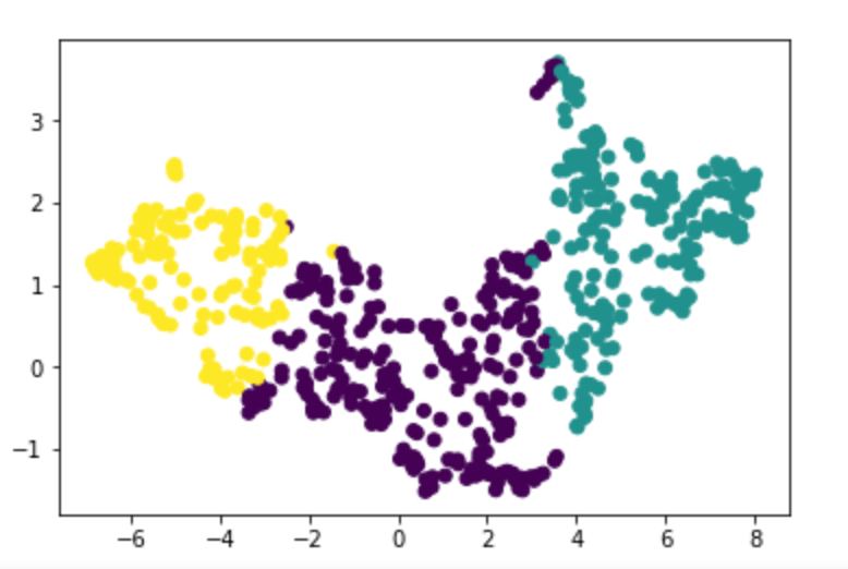
It’s obviously not easy to make any conclusions from this UMAP visualization alone, so I took some samples from all of the clusters highlighted by the algorithm.

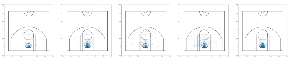

Above, each row represents one cluster highlighted by the algorithm. The first row is obviously a cluster that highlights players that do not deviate from the paint much. It includes players like Dwight Howard and Ben Simmons.
However, the other two clusters that the algorithm highlighted seem extremely similar (2 and 3). Personally, I don’t see any stark differences between the two clusters, but in general, it seems like the second cluster is more inclined to “Moreyball”, meaning people in the second cluster take less mid-range shots than do people of the second cluster. However, the difference seems very low-key so I’m not really sure.

These are the relative amounts of each cluster in the overall dataset. It makes sense, as the number of players who only play in the paint is very low.


Here, the first row highlighted seems to be players who exemplify the “baseline game”. This makes sense as the baseline game was very prominent in the seasons we’re looking at.
The second cluster seems to highlight players who mainly rely on the mid-range game, and don’t really venture much into three-point-range. The third cluster seems to use the mid-range game, but also goes to three point game. The distinction between these two isn’t too eye-catching.

These are the relative frequencies of each cluster in the dataset. The mid-range game was quite prominent during this age, and the algorithm seems to agree.
Conclusion
Really, the only cluster that seems to exist in both eras of basketball is the cluster with mid-range and three-point shooters. This really speaks to the quickly changing nature of basketball. The baseline two is not being used much at all, nor is the pure mid-range game. This is clearly the result of analytics in the sport, as these shots just don’t provide as much efficiency.
There are definitely things that I can do better in this project. If you have any suggestions, I can definitely try implementing them.
All the code is at https://github.com/avyayv/blogposts/blob/master/clustershotcharts/
Thanks to Savvas Tjortjoglou for his code for outlining the NBA court in matplotlib.

2 thoughts on “Clustering NBA Shot Charts (Part 1)”