My previous blog post showed how cluster-able NBA shot charts were. I recently made a few improvements to the model and looked into things that I didn’t look into in the previous article.
A quick summary of that article is that I generated a 14 dimensional vector with shot frequencies for different locations on the court. Then I ran k-means clustering on this vector for each player over a season.
Most of the methodology is the same between the two, so please read the other article for more depth.
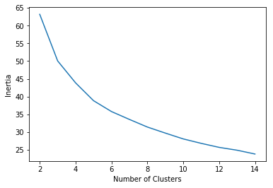
Number of Clusters
In my previous iteration, I used 3 clusters. However, I generated a plot that aimed to find the optimal number of clusters. Using the ‘elbow-method’ for k-means clustering, I found that the optimal number of clusters was probably a bit more, around 5.
Clustering Results
After running the clustering algorithm, these were 5 example shot charts for each cluster.
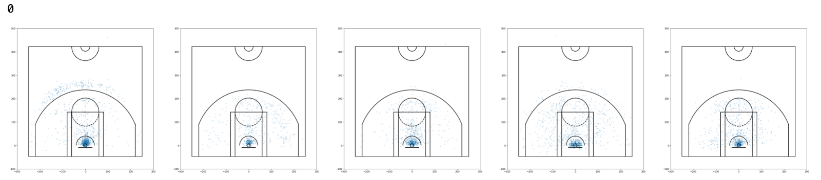
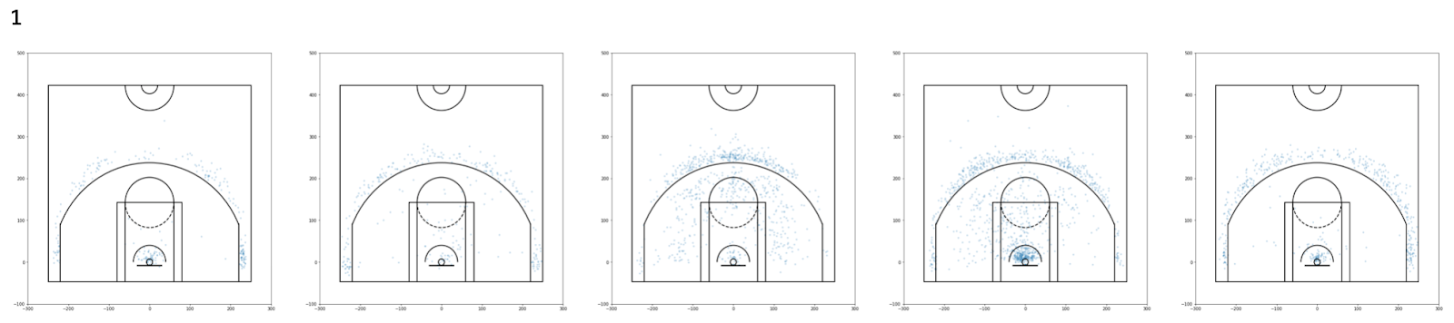
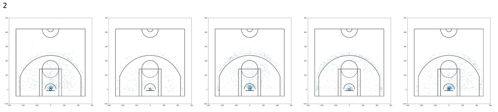
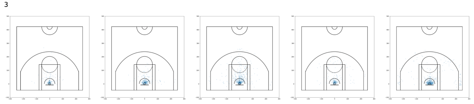

Since we added more clusters, I interpreted what each of these clusters meant.
Cluster 0 seems to represent players who mainly shoot in the paint, but can shoot outside the paint. They don’t shoot many threes. My assumption is that these players used to be traditional big man but are in the transition of becoming stretch forwards.
Cluster 1 seems to represent players who shoot threes and shots in the paint (Moreyball ideals). However, they seem to shoot more threes than paint shots.
Cluster 2 seems to represent players who prefer to shoot midrange shots.
Cluster 3 seems to represent players who play in the paint and leave the paint extremely rarely.
Cluster 4 seems to represent players who shoot threes and shots in the paint (Moreyball ideals). However, they seem to shoot more paint shots than threes.
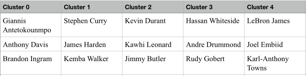
These are some of the notable players from each of the clusters. Interestingly, LeBron James and Joel Embiid are in the same cluster. Obviously they are not the same type of player, but their shooting tendencies are quite similar. This is why adding something like assist data could be beneficial to the performance of this model.
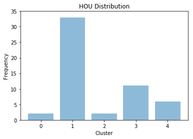
I was curious so I looked at the Rockets’ distribution of clusters for 2018-19 and this is what I got.
In comparison, this is what the Knicks were.
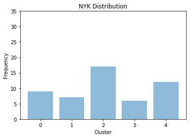
This highlights that the Rockets really rely on Moreyball a lot (fitting :D), and mainly focus on the three-point aspect of their strategy. Further, the Knicks distribution shows that the Knicks aren’t that progressive in their methods (we knew that).
I then cross referenced the cluster with some statistics to see which clusters relied on the ball a bit more.
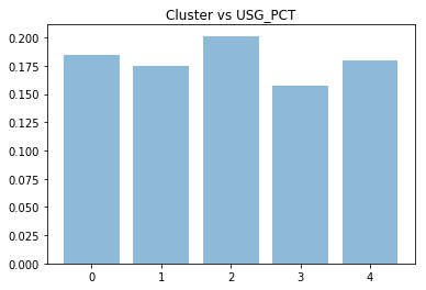
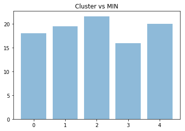
These two charts show how the midrange cluster tends to have more opportunity than other clusters. Personally, I believe this has to do with the close correlation between people who shoot from midrange and their reliance on isolation basketball. Players like Kevin Durant, Jimmy Butler, and Carmelo Anthony all fall into this cluster and they are known for playing isolation basketball.
I also cross referenced the clusters with some player statistics, like three point percentage and field goal percentage.


These two graphs help us see that cluster 1 shoots a lot of threes, as they have a higher three point percentage than all the other clusters, but a lower field goal percentage. Further, we can confirm that cluster 3 is the “traditional big man” and is full of extremely poor three point shooters.
Interestingly cluster 2 and cluster 4 have similar percentages for both three point percentages and field goal percentages. However, cluster 2 shoots less threes and more mid-range jumpers, which in general, is less efficient. This is highlighted with EFG% below.
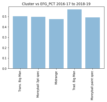
Cluster 0 is also quite poor at shooting, but they still venture out of the paint more often than cluster 3. When we watch Giannis and Anthony Davis play, we can easily identify this, as we know they are trying to expand their game to the three point shot. However, they are not that efficient from the three point line at the moment.
These graphs also further confirm that midrange players are the least efficient shooters in terms of EFG% and that traditional big men (or merely players who don’t deviate much from the pain) are the most efficient in this sense.
Cluster Distribution Over Time

In the previous blog post, I generated different clusters for each of these years. However, I thought it would be interesting to use the same clusters and see how the distribution of the clusters changed over time.
We see that cluster 2 used to be the most popular for many years. However, with the rise of Moreyball and efficiency, we see that cluster 1 and 4 have become more popular in recent years.
The distribution of the clusters, interestingly, did not change much from 1999-00 to 2008-09. Over this entire timeframe, the number of midrange players decreased slightly, but it is not noticeable. Only recently do we see this complete change in the distribution of clusters.
Future Work
I want to see if I can correlate these clusters to win percentage in some way. This way, we can see what clusters directly translate to winning. I also want to add other mapped data (such as where assists were made from, where rebounds were taken) and see if this helps better cluster players.
You can view all of the players in each of the clusters here https://docs.google.com/spreadsheets/d/1OphZnMi5a0vYPI_QZ1q8mRANT68oocZVQeKJIAK6nv4/edit?usp=shar
