When we look at games in the playoffs, we see completely different strategies employed by teams. Star players seem to be more relied on than they would in the regular season, while players with smaller roles seem to be less useful than in the regular season. This ‘hunch’ can be represented with a graph of usage rates in the playoffs vs in the regular season. Here is a graph (with a line created with a basic linear regression algorithm).

This graph’s line has a slope of 0.966, which basically means that overall, players normally do not deviate from their regular season usage rate. However, the R^2 value (which here is essentially a metric that evaluates how good of a line of best fit is) is 0.679, which isn’t that good (The optimal R^2 value in statistics is 1.0). Further, when we examine the graph, we see that players with considerably higher usage rate tend to be above the line of best fit.
To isolate player’s into different types, I decided to split players by the number of minutes. I split them into the following groups:
- 35+ Minutes in the regular season
- 25-35 Minutes in the regular season
- 15-25 Minutes in the regular season
- 5-15 Minutes in the regular season
35+ Minutes (Slope = 1.01, R^2 = 0.808)

The graph above is quite interesting as it shows that heavily relied on players do not typically get used more in the Playoffs. Rather, they get used about as often in the playoffs versus in the regular season. The R^2 value is also close to one, so the line is fairly accurate in predicting this underlying relationship.
25-35 Minutes (Slope = 0.938, R^2 = 0.695)

With the slope of this graph, we see that players who play 25-35 minutes seem to get the ball less often than in the regular season. However, interestingly, the spread between the points and the line is more than with the players with more than 35+ minutes (This is shown with the lower R^2 value as well). This means that players who have 25-35 minutes have more variation in their usage rate.
15-25 Minutes (Slope = 0.907, R^2 = 0.521)
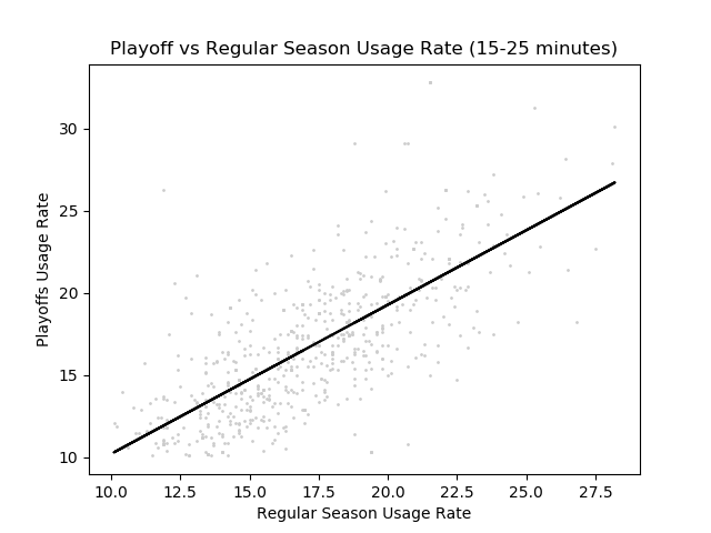
Here, we see that there is an even lower slope but also a lower R^2 value. This means that variation is even higher than players with 25-35 minutes and on average players get less usage. With this low of an R^2 value, the line of best fit barely works as a guideline. This means we cannot really predict how much the player’s usage rate will change in the playoffs. In the next group, we will see an even better example of this.
5-15 Minutes (Slope = 0.877, R^2 = 0.292)

When we look at this graph, we see that there really isn’t much of a trend in the data. This means that when a player’s minutes are this low, there isn’t a real correlation between a player’s usage rate in the regular season vs. in the playoffs. Instead, it requires more data (i.e a player’s points per minute, assists per minute, etc).
To see what actually determines usage at these lower percentages, I trained a neural network where I inputted some basic stats per minute, offensive rating, defensive rating, along with the player’s usage rate in the regular season. This got me a much higher R^2 Value for these lower minute value, which shows what teams really look for in these players who get fewer minutes. For the actual neural network code and the rest of the code used for this post look here.
Conclusion
When players are more relied on (play more minutes), they are more likely to keep the same usage rate. However, as the number of minutes that a player plays decreases, the variation increases tremendously. Thus, player efficiency is integral to determine how much a player will be used at these lower minute values.
