I recently tweeted some assist heat maps that were generated using 2015-16 SportVU data here.
Although the individual player heat maps are interesting, I wanted to look at more league-wide trends. I also wanted to explain my methods a little bit more.
Why?
The reason why I found this specific problem interesting was because of its potential implications.
Players in the NBA and all of basketball have inherent bias for where they prefer shots. For instance, if a player like Ben Simmons were standing at the 3-point line, you wouldn’t guard him as tightly as you would Stephen Curry. Essentially, you could adjust coaching strategy if you better understand player tendencies.
Analysis of the specific locations of which players prefer to pass and shoot could prove useful, as it would help players anticipate what could happen next in a specific play. This would eventually improve defensive strategy for teams.
Methods
As I stated above, I used the 2015-16 SportVU data for the generation of these graphs. This data captures every single player on the court and the ball ~25 times every second. Although it would have been optimal to have multiple seasons’ worth of data, I was unable to find it.
I cross-reference this SportVU data with play-by-play data from stats.nba.com to determine when assists occur.
Then, using an approximate timing of the assist event from the play-by-play data, I record the location of both the passer and the shooter. This entire process is done with pandas and Python.
After this, I use a KDE or kernel density estimator from Seaborn to generate the heat map plot. The KDE allows us to use our sparse data into more of a continuous spectrum for better visualization.
The visualization is heavily based on the post at http://savvastjortjoglou.com/nba-shot-sharts.html on visualizing NBA shot charts.
Overall League
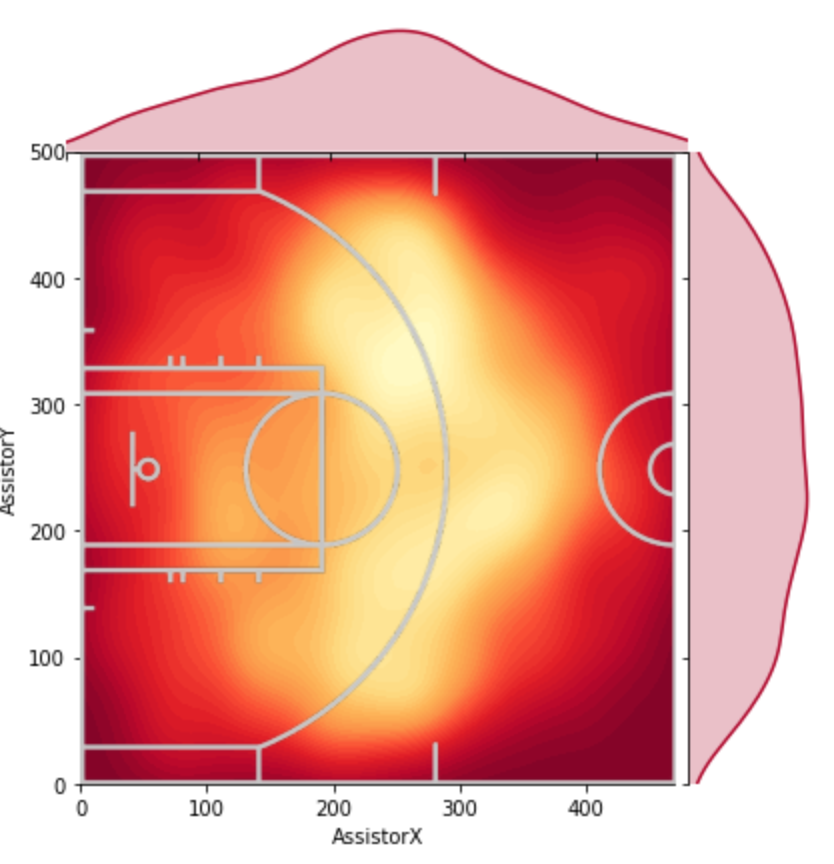 |  |
As stated in the caption, the left image is a heat map of all the assist locations in my limited dataset. The right image is a visualization of just the shots off of those assists.
Right off the bat, there seems to be more variation in the locations in which players take shots than where they pass from. This makes sense, as point guards are typically the ones assisting the ball, most of whom stay around the top of the key.
Clearly, based on the dataset, “drive-and-kick” assists aren’t as common as the normal, top of the key assist.
Further, as expected, we see that players standing in the corner are more likely to shoot than make a pass.
How good is the generalization?
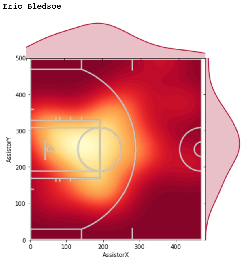 | 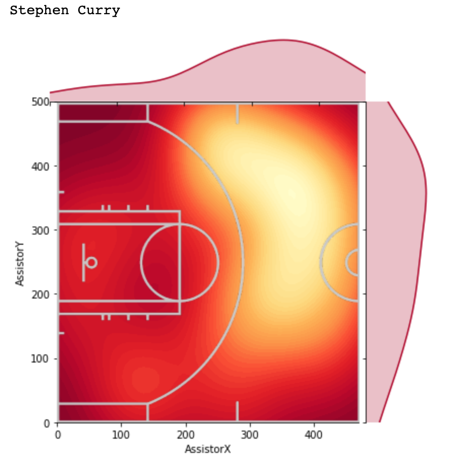 | 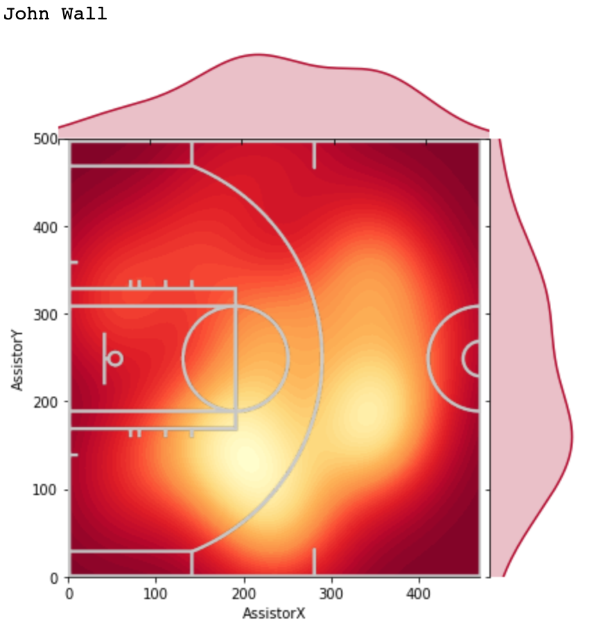 |
The above charts show that the generalization above does not capture the variability per player.
Even for players who play the same position (PG): Eric Bledosoe, Stephen Curry, and John Wall, there are stark differences between their individual assist charts.
It was interesting to me that Steph has a tendency to assist from the right side of the court, while John Wall has a tendency to do so from the left side. However, with the limited size of the dataset I was working with, it’s possible that the data I was given does not capture the full picture.
What can we do with this information? Well, we clearly see that Eric Bledsoe is more likely to pass when he’s in the paint versus when he’s at the three-point line. If a coach is able to adjust his strategy of how to defend a player like Bledsoe, it would likely improve that team’s overall defensive numbers.

To me, LeBron specifically was especially interesting. It seems as though, of all of the stars with significant assist numbers, LeBron has the most unpredictable assist locations.
This is one of the aspects of LeBron’s game that makes him such a difficult player to defend. Not only can he shoot and pass, but he can do both of these actions pretty much anywhere on the court.
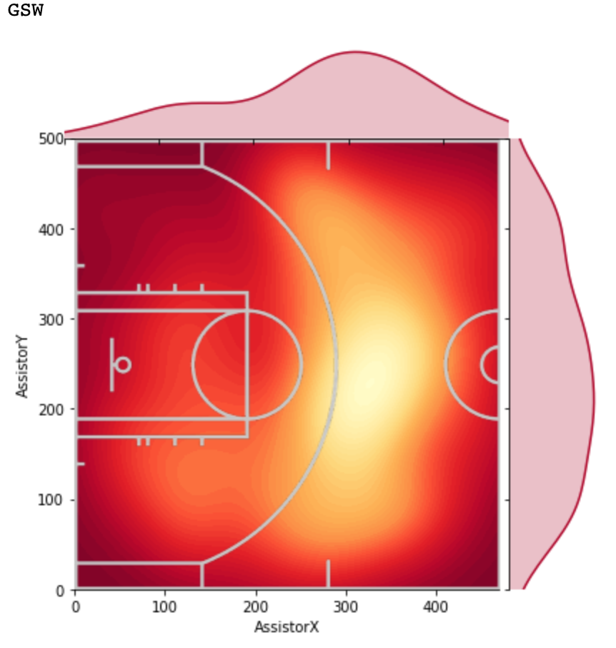 | 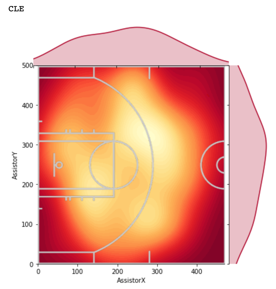 | 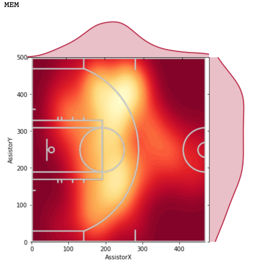 |
Not only that, but teams also have stark differences overall. Above are 3 different teams, the Warriors, Cavaliers, and Grizzlies. All of these teams have vastly different ways of play, and as a result have different locations in which they pass.
Future Work
In the future, I want to be able to apply these similar types of visualizations to other seasons’ tracking data. As stated here, it would be interesting to see how players/teams change over time.
I also think it might be interesting to run a sort of clustering algorithm on this data combined with shot chart data, to identify types of players.
If you have any suggestions on what else I could do with this information, please let me know through email (avyayv@gmail.com) or Twitter (@avyvar)

One thought on “Where do assists come from? (Part 1)”